

Why:
I was trying to make some changes to a Semantic header component. Certain changes were going just fine, but other things like hover styling were giving me trouble. This led me to believe that Semantic has some !important tags under the hood, and after I went digging, I was right. Rather than change Semantic’s style rules and risk weird and unintended consequences, I (begrudgingly) settled on using an !important tag. Given the problems that those tags can cause, I knew there had to be a better way.
(Good news! There is! 🎉)
❗️important: don’t use !important.
Before we can understand why we shouldn’t be using !important, we first need to go over a little CSS background. CSS follows the source order rule, which refers to the order in which your style rules are read by the browser. For example:
<div class=example>
  <p>This is the text inside the div</p>
</div>
HTML
.example {
  color: bisque;
  background: bisque;
}
.example {
  color: chocolate;
}
CSS
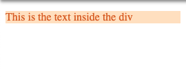
As you can see, the second instance of .example overrides the previous color rule and we get chocolate text. 🍫
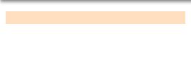
Now imagine you are working on a huge app with CSS scattered all over the place or buried in a style library. If our .example class has an !important tag after the bisque color, we’re stuck with bisque on bisque. While that might not be so bad on a cold winter day, it doesn’t make for great web design.
So what can we do to fix this? You might think adding an !important tag to chocolate would fix things, and you’re not wrong. But you’re also not right. When multiple conflicting CSS rules have !important tags on them, it falls back to the source order rule — when everything is important, nothing is important. You’re just digging yourself deeper into the hole.

So… what can we do to fix this?
As the article title suggests, one option (amongst many) is to use Styled Components. I’ll get into that in a bit. The other strategy relies on another property of CSS: specificity. Another example:
<div class=example>
  <h1>This is the header tag</h1>
  <p>This is just a p tag</p>
  <p id=specific-id>This is a p tag with a specific ID</p>
<div/>
HTML
.example {
  background: bisque;
  color: bisque;
}
p {
  color: chocolate;
}
#specific-id {
  font-size: 1.5rem;
}
CSS
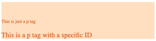
As you can see, the more specific our CSS gets, the finer control we have over what gets rendered. A few things are going on here:
- The h1 is getting rendered, but the text color matches the background.
- More specifically, we have told all p tags to render in chocolate color.
- Even more specific than that, anything with the #specific-id will render at a larger font size.
Take note, however, that unless we override a style rule as we get more specific, the rule will be inherited from the parent. This is why our #specific-id is still chocolate-colored, even though we didn’t set that as an ID specific rule.
This strategy works fine in a pinch, but creating and managing dozens of IDs is not scalable, nor is it my idea of fun.
Styled Components 💅
Styled Components is a library that “removes the mapping between components and styles”. When you create a style using Styled Components, it’s just creating a normal React component with a unique style sheet. A couple of things to keep in mind:
- Each styled component you make will have a unique class that is listed after the inherited classes of the original object (if there were any). This is important, because of source order — Styled Components (aka you) get the last say in what goes on.
- Because each class is unique to the styled component, we are no longer in trouble if we need to use the !important tag. It will be scoped specifically to that component, and none other.
In practice this looks like:
import React, { Component } from 'react';
import { Button } from 'semantic-ui-react';
import { StyledButton } from './styledComponents';

export default class App extends Component {
  render(){
    return(
      <div>
          <Button>This is a normal Semantic button</Button>
          <StyledButton>This is a Semantic button that has been styled with Styled Components</StyledButton>
      </div>
    );
  }
}
import React from 'react';
import styled from 'styled-components';
import { Button } from 'semantic-ui-react';
export const StyledButton = styled(Button)({
color: 'red!important'
});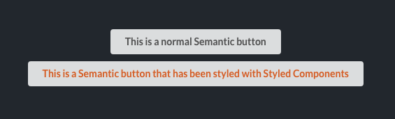
We’ve used the !important tag to change the button’s color to chocolate, but since Styled Components manages unique class names for us, we don’t need to worry about it affecting anything other buttons. All we needed to do was import the Semantic components we needed into our styledComponent.js file, and pass them into styled(). From there we can make all the changes we need, throw around !important’s to override anything we don’t want, and rest easy knowing that they won't wreak havoc on other styles.
Other bonuses:
- Just like any other component, Styled Components can be reused.
- Existing props will still work (i.e. onClick, mapping, etc.).
- They work with media queries and selectors for mobile-friendly and dynamic styling.


%20(1).svg)

.svg)


